
Hyoumankind
We established a new, more holistic purpose for Hyoumankind – one that made lives better in a physical, emotional and spiritual way – especially in a category that was very clean, white and performance driven. This was about inner beauty: the amazing things you can achieve when you’re at the top of your game. And that all starts with sleep.
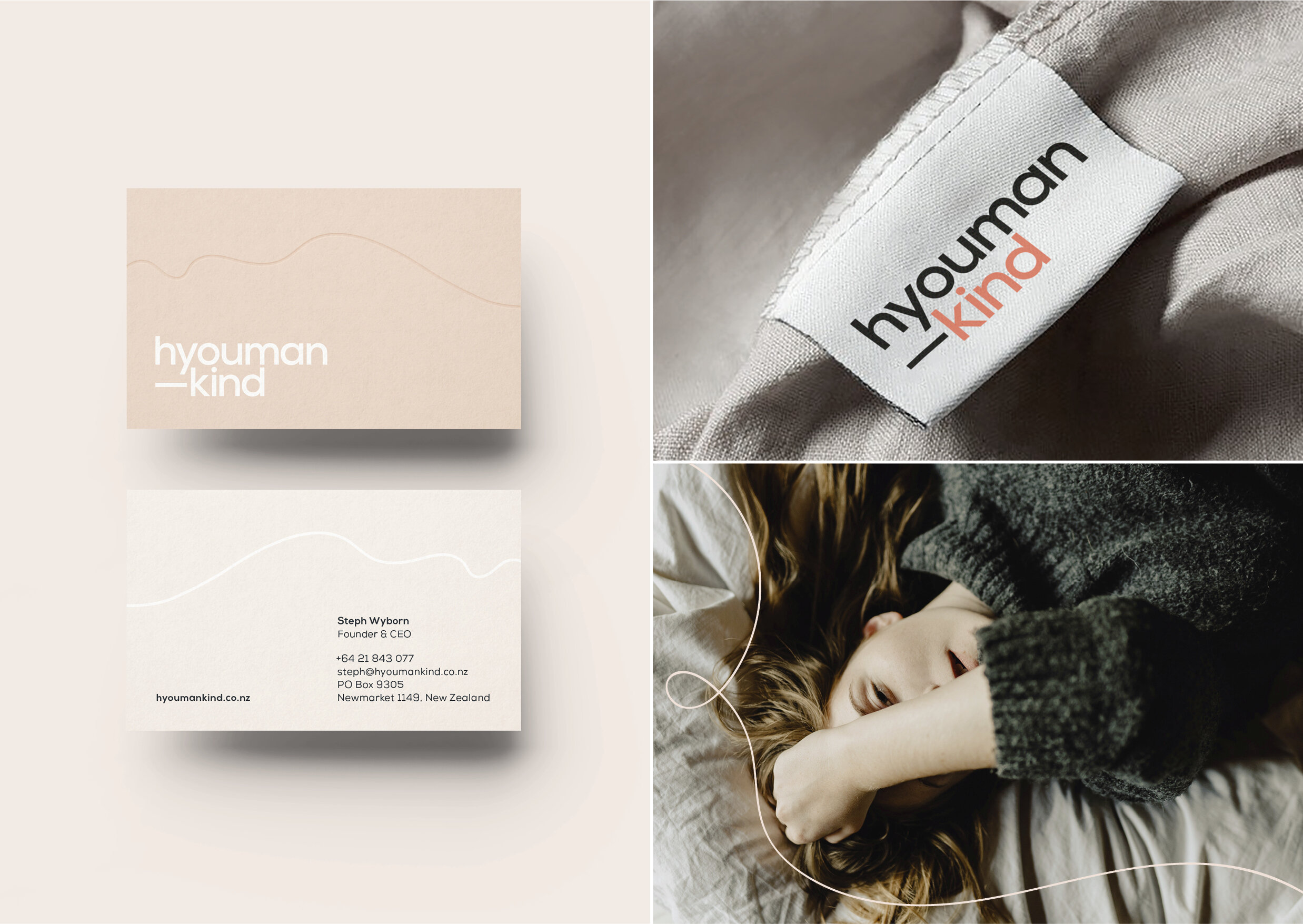
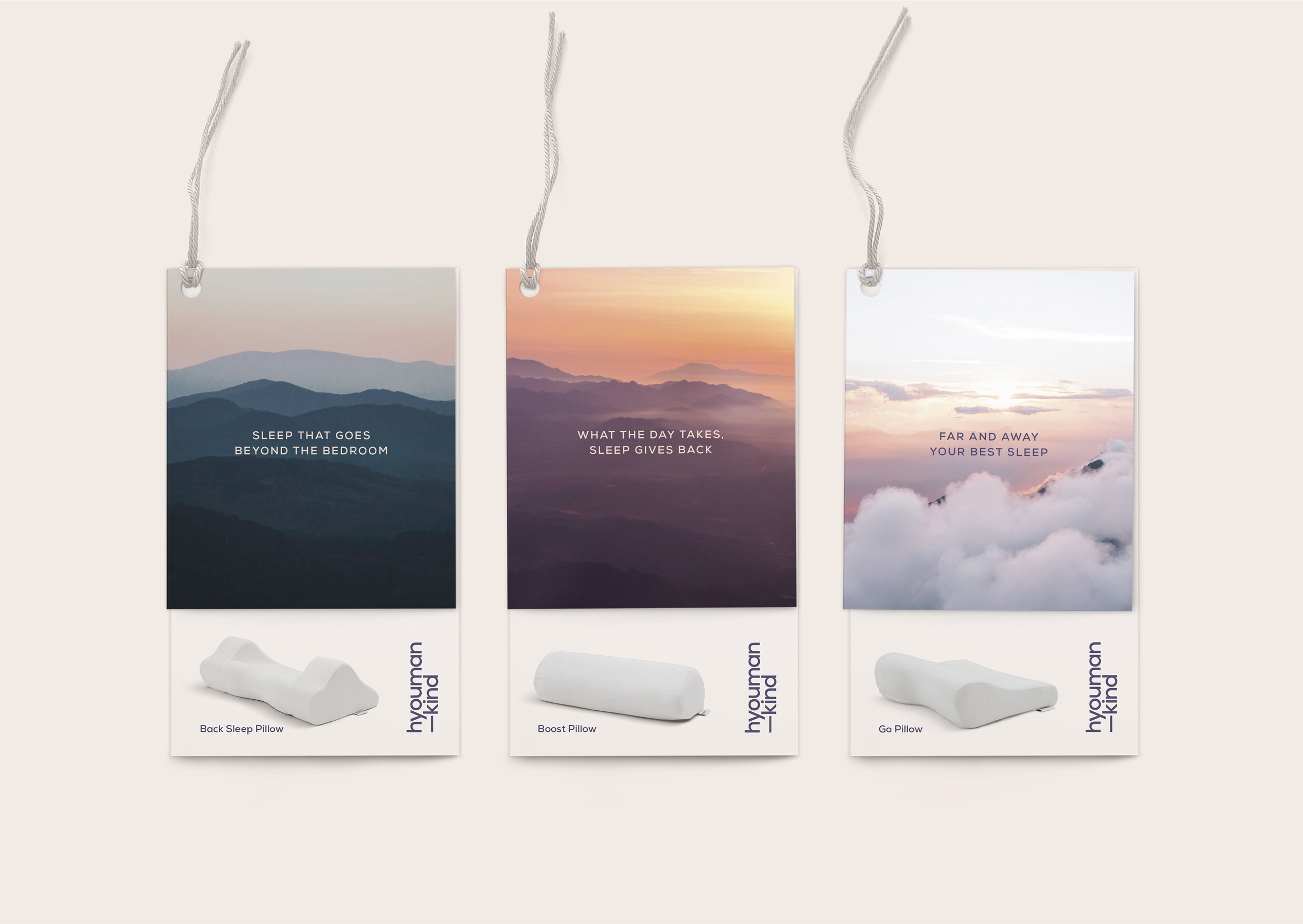
The Hyoumankind brand positioning became ‘Waking up to sleep’ – offering a product that optimised science and design for wellness, performance and recovery. We developed a graphic system inspired by the curves of the body and the shape of the pillows, which was also taken across the new wordmark.
This was supported by a softer, dreamlike colour palette and epic, emotive landscape photography that reflected dusk and dawn, those natural and magical times between falling asleep and waking up. Our language too was more holistic, recognising and understanding the human truth behind sleep and the benefits of sleeping better.
–
Category
Identity, Communication & Website
Client
Hyoumankind
Credits
Milk Brand Agency
Creative & Design Director: Sarah Melrose
Strategist: Anna Hart
Design Team: Jeannie Burnside, Natasha Vermeulen